
Postingan lainnya
Buku Ini Koding!
Baru!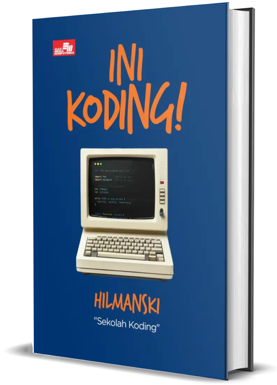
Buku ini akan jadi teman perjalanan kamu belajar sampai dapat kerjaan di dunia programming!
Kelas Premium!
Belajar bikin website dari nol sekarang
Gunakan kupon "lebihcepat" untuk diskon 25%!
slider tidak sesuai
slider nya ada 2 gambar, tapi kok menampilkan 3 gambar, dan 1 gambar kan emg gak ada, jadi kosong tanpa gambar .. mohon solusinya
 <div class="slider">
<div class="rslides_container">
<ul class="rslides">
	<li><img alt="" data-min-width-1400="img/slider.jpg" src="img/slider_medium.jpg" />
	<div class="container">
	<div class="caption">
	<h1>lorem ipsum</h1>

	<h1><span>HELLOWW</span></h1>

	<h1>lorem ipsum</h1>
	</div>
	</div>
	</li>
	<li><img alt="" data-min-width-1400="img/slider1.jpg" src="img/slider1_medium.jpg" />
	<div class="container">
	<div class="caption">
	<h1>accouisitionM</h1>

	<h1><span>set</span></h1>

	<h1>damage</h1>
	</div>
	</div>
	</li>
</ul>
</div>
</div>
<!-- slider end -->

0
2 Jawaban:
.rslides {
  position: relative;
  list-style: none;
  overflow: hidden;
  width: 100%;
  padding: 0;
  margin: 0;
  }

.rslides li {
  -webkit-backface-visibility: hidden;
  position: absolute;
  display: none;
  width: 100%;
  left: 0;
  top: 0;
  }

.rslides li:first-child {
  position: relative;
  display: block;
  float: left;
  }

.rslides img {
  display: block;
  height: auto;
  float: left;
  width: 100%;
  border: 0;
  }

.caption {
  position: absolute;
  bottom: 0;
  right: 0;
  padding: 15px;
  text-align: center;
  top: 192px;
  display: inline-block;
  height: 200px;
}
@media (max-width:800px){
.caption {
  top: 72px;
  }
}

/* --------------------------------

Main components

-------------------------------- */
.cd-testimonials-wrapper {
  position: relative;
  width: 100%;
  max-width: 100%;
  margin: 2em auto;
  z-index: 1;
}

@media only screen and (min-width: 768px) {
  .cd-testimonials-wrapper {
    margin: 0 auto;
    padding: 0;
  }
}
@media only screen and (min-width: 1170px) {
  .cd-testimonials-wrapper::after {
    /* quotation mark visible */
    display: block;
  }
}

.cd-testimonials {
  color: #ffffff;
  text-align: center;
}
.cd-testimonials::after {
  clear: both;
  content: "";
  display: table;
}
.cd-testimonials > li {
  position: absolute;
  opacity: 0;
}
.cd-testimonials > li:first-child {
  position: relative;
  opacity: 1;
}
.cd-testimonials p {
  font-style: italic;
  line-height: 1.4;
  margin-bottom: 1em;
  padding: 0 14px;
}
@media only screen and (min-width: 768px) {
  .cd-testimonials p {
    font-size: 22px;
    font-size: 1.375rem;
  }
}
@media only screen and (min-width: 1170px) {
  .cd-testimonials p {
    font-size: 26px;
    font-size: 1.625rem;
    line-height: 1.6;
  }
}

.cd-author img, .cd-author .cd-author-info {
  display: inline-block;
  vertical-align: middle;
}
.cd-author img {
  width: 32px;
  height: 32px;
  border-radius: 50%;
  margin-right: 5px;
  box-shadow: 0 0 6px rgba(0, 0, 0, 0.3);
}
.cd-author .cd-author-info {
  text-align: left;
  line-height: 1.2;
}
.cd-author .cd-author-info li:first-child {
  font-size: 14px;
  font-size: 0.875rem;
}
.cd-author .cd-author-info li:last-child {
  font-size: 12px;
  font-size: 0.75rem;
  color: #6b6b70;
}
@media only screen and (min-width: 768px) {
  .cd-author img {
    width: 50px;
    height: 50px;
  }
  .cd-author .cd-author-info {
    line-height: 1.4;
  }
  .cd-author .cd-author-info li:first-child {
    font-size: 16px;
    font-size: 1rem;
  }
  .cd-author .cd-author-info li:last-child {
    font-size: 14px;
    font-size: 0.875rem;
  }
}

.flex-direction-nav li {
  position: absolute;
  height: 100%;
  width: 40px;
  top: 0;
}
.flex-direction-nav li:first-child {
  left: 0;
}
.flex-direction-nav li:last-child {
  right: 0;
}
.flex-direction-nav li a {
  display: block;
    height: 30px;
  width: 30px;
  /* image replacement */
  overflow: hidden;
  text-indent: 100%;
  white-space: nowrap;
  -webkit-transition: background-color 0.2s;
  -moz-transition: background-color 0.2s;
  transition: background-color 0.2s;
    margin-top: 55px;
}
.flex-prev{
  background: url('../img/left-arrow.png');
}
.flex-next{
  background: url('../img/right-arrow.png');
}
.no-touch .flex-direction-nav li a:hover {
  background-color: #323234;
}

.flex-direction-nav li a::before {
  -webkit-transform: translateY(-35px) rotate(45deg);
  -moz-transform: translateY(-35px) rotate(45deg);
  -ms-transform: translateY(-35px) rotate(45deg);
  -o-transform: translateY(-35px) rotate(45deg);
  transform: translateY(-35px) rotate(45deg);
}
.flex-direction-nav li a::after {
  -webkit-transform: translateY(-27px) rotate(-45deg);
  -moz-transform: translateY(-27px) rotate(-45deg);
  -ms-transform: translateY(-27px) rotate(-45deg);
  -o-transform: translateY(-27px) rotate(-45deg);
  transform: translateY(-27px) rotate(-45deg);
}
.flex-direction-nav li:last-child a::before {
  -webkit-transform: translateY(-35px) rotate(-45deg);
  -moz-transform: translateY(-35px) rotate(-45deg);
  -ms-transform: translateY(-35px) rotate(-45deg);
  -o-transform: translateY(-35px) rotate(-45deg);
  transform: translateY(-35px) rotate(-45deg);
}
.flex-direction-nav li:last-child a::after {
  -webkit-transform: translateY(-27px) rotate(45deg);
  -moz-transform: translateY(-27px) rotate(45deg);
  -ms-transform: translateY(-27px) rotate(45deg);
  -o-transform: translateY(-27px) rotate(45deg);
  transform: translateY(-27px) rotate(45deg);
}
@media only screen and (min-width: 768px) {
  .flex-direction-nav li {
    width: 50px;
  }
}
@media only screen and (min-width: 1170px) {
  .flex-direction-nav li a::before, .flex-direction-nav li a::after {
    background-color: #5e5e63;
    -webkit-transition: background-color 0.2s;
    -moz-transition: background-color 0.2s;
    transition: background-color 0.2s;
  }
  .flex-direction-nav li a:hover::before, .flex-direction-nav li a:hover::after {
    background-color: #ffffff;
  }
}

.cd-see-all {
  position: absolute;
  z-index: 1;
  left: 0;
  bottom: 0;
  width: 100%;
  height: 50px;
  line-height: 50px;
  background-color: #252527;
  text-align: center;
  text-transform: uppercase;
  color: #6b6b70;
  font-weight: 700;
  font-size: 12px;
  font-size: 0.75rem;
  -webkit-transition: color, 0.2s;
  -moz-transition: color, 0.2s;
  transition: color, 0.2s;
}
.no-touch .cd-see-all:hover {
  color: #79b6e4;
}

.cd-testimonials-all {
  position: fixed;
  top: 0;
  left: 0;
  height: 100%;
  width: 100%;
  background-color: #ffffff;
  z-index: 2;
  visibility: hidden;
  opacity: 0;
  -webkit-transition: opacity .3s 0s, visibility 0s .3s;
  -moz-transition: opacity .3s 0s, visibility 0s .3s;
  transition: opacity .3s 0s, visibility 0s .3s;
}
.cd-testimonials-all .cd-testimonials-all-wrapper {
  position: absolute;
  left: 0;
  top: 0;
  height: 100%;
  width: 100%;
  overflow: auto;
}
.cd-testimonials-all .cd-testimonials-all-wrapper > ul {
  width: 90%;
  max-width: 1170px;
  margin: 4em auto;
}
.cd-testimonials-all .cd-testimonials-all-wrapper > ul::after {
  clear: both;
  content: "";
  display: table;
}
.cd-testimonials-all .cd-testimonials-item {
  margin-bottom: 2em;
  opacity: 0;
  /* Force Hardware Acceleration in WebKit */
  -webkit-transform: translate3d(0, 0, 0) scale(0.4);
  -moz-transform: translate3d(0, 0, 0) scale(0.4);
  -ms-transform: translate3d(0, 0, 0) scale(0.4);
  -o-transform: translate3d(0, 0, 0) scale(0.4);
  transform: translate3d(0, 0, 0) scale(0.4);
  -webkit-backface-visibility: hidden;
  backface-visibility: hidden;
  -webkit-transition: -webkit-transform .3s, opacity .3s;
  -moz-transition: -moz-transform .3s, opacity .3s;
  transition: transform .3s, opacity .3s;
}
.cd-testimonials-all p {
  position: relative;
  background: #79b6e4;
  color: #ffffff;
  padding: 2em;
  -webkit-font-smoothing: antialiased;
  -moz-osx-font-smoothing: grayscale;
  line-height: 1.4;
  border-radius: 0.25em;
  margin-bottom: 1em;
}
.cd-testimonials-all p::after {
  /* creating the triangle in css */
  content: '';
  position: absolute;
  top: 100%;
  left: 2em;
  height: 0;
  width: 0;
  border: 8px solid transparent;
  border-top-color: #79b6e4;
}
.cd-testimonials-all .cd-author {
  text-align: left;
  margin-left: 1.5em;
}
.cd-testimonials-all .cd-author img {
  box-shadow: 0 0 0 transparent;
}
.cd-testimonials-all.is-visible {
  visibility: visible;
  opacity: 1;
  -webkit-transition: opacity .3s 0s, visibility 0s 0s;
  -moz-transition: opacity .3s 0s, visibility 0s 0s;
  transition: opacity .3s 0s, visibility 0s 0s;
}
.cd-testimonials-all.is-visible .cd-testimonials-all-wrapper {
  -webkit-overflow-scrolling: touch;
}
.cd-testimonials-all.is-visible .cd-testimonials-item {
  opacity: 1;
  -webkit-transform: translate3d(0, 0, 0) scale(1);
  -moz-transform: translate3d(0, 0, 0) scale(1);
  -ms-transform: translate3d(0, 0, 0) scale(1);
  -o-transform: translate3d(0, 0, 0) scale(1);
  transform: translate3d(0, 0, 0) scale(1);
}
@media only screen and (min-width: 768px) {
  .cd-testimonials-all .cd-testimonials-item {
    width: 46%;
    margin: 0 2% 3em;
  }
  .cd-testimonials-all .cd-author {
    margin-left: 1em;
  }
}
@media only screen and (min-width: 1170px) {
  .cd-testimonials-all .cd-testimonials-item {
    width: 30%;
    margin: 0 1.6666% 3em;
  }
}

.close-btn {
  position: fixed;
  display: block;
  width: 40px;
  height: 40px;
  top: 10px;
  right: 5%;
  /* image replacement */
  overflow: hidden;
  text-indent: 100%;
  white-space: nowrap;
}
.close-btn::before, .close-btn::after {
  /* close icon in css */
  content: '';
  position: absolute;
  display: inline-block;
  width: 2px;
  height: 24px;
  top: 8px;
  left: 19px;
  background-color: #39393c;
}
.close-btn::before {
  -webkit-transform: rotate(45deg);
  -moz-transform: rotate(45deg);
  -ms-transform: rotate(45deg);
  -o-transform: rotate(45deg);
  transform: rotate(45deg);
}
.close-btn::after {
  -webkit-transform: rotate(-45deg);
  -moz-transform: rotate(-45deg);
  -ms-transform: rotate(-45deg);
  -o-transform: rotate(-45deg);
  transform: rotate(-45deg);
}
ini css nya untuk slider
0
