
Postingan lainnya
Buku Ini Koding!
Baru!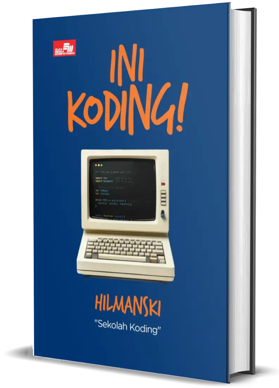
Buku ini akan jadi teman perjalanan kamu belajar sampai dapat kerjaan di dunia programming!
Kelas Premium!
Belajar bikin website dari nol sekarang
Gunakan kupon "lebihcepat" untuk diskon 25%!
tabel responsive
caranya buat tabel lebih responsive dari css gimana ya, mohon bantuannya

0
2 Jawaban:
Silakan gunakan css Bootstrap mas, disana ada table responsive langsung jadi tidak perlu repot untuk membuatnya. Tinggal panggil classnya saja mas.
0

Bisa pakek @media contoh codenya kyk gini,
/*
	Max width before this PARTICULAR table gets nasty
	This query will take effect for any screen smaller than 760px
	and also iPads specifically.
*/
     @media
	only screen and (max-width: 760px),
	(min-device-width: 768px) and (max-device-width: 1024px)  {

		/* Force table to not be like tables anymore */
		table, thead, tbody, th, td, tr {
			display: block;
		}

		/* Hide table headers (but not display: none;, for accessibility) */
		thead tr {
			position: absolute;
			top: -9999px;
			left: -9999px;
		}

		tr { border: 1px solid #ccc; }

		td {
			/* Behave  like a "row" */
			border: none;
			border-bottom: 1px solid #dedede;
			position: relative;
			padding-left: 50%;
		}

		td:before {
			/* Now like a table header */
			position: absolute;
			/* Top/left values mimic padding */
			top: 6px;
			left: 6px;
			width: 45%;
			padding-right: 10px;
			white-space: nowrap;
		}

		/*
		Label the data
		*/
		td:nth-of-type(1):before { content: "No"; }
		td:nth-of-type(2):before { content: "Status"; }
		td:nth-of-type(3):before { content: "Description"; }
		td:nth-of-type(4):before { content: "Date"; }
		td:nth-of-type(5):before { content: "Action"; }
	}
0
